
What is colour psychology?
Colour psychology is a crucial aspect of property staging today; it plays a significant role in how a property looks. Styling a property with the right colours, the right style and the right furniture can go a long way to creating warmth and personality in a room. The process of using the right colours, though, is somewhat challenging.
You can create an immediate sense of feeling and mood within the room just by going down the route of properly putting together compatible colour palettes. In essence, a colour can paint a picture of the room’s mood and can help sell the property by creating an idyllic environment for the buyer to imagine themselves in if they purchase the property.
Using a blend of colours that complement each other, can create a whole new look within the room that inspires the buyer. From using more complex shades in high-end properties to keeping things in simple tones for everyday properties, colour psychology is critically important so buyers can envisage themselves living their best life within the property.
Three key colours within colour psychology in Brisbane property staging
Blue. Blue is a great colour to use within colour psychology as it is associated with the personality trait of confidence. Blue is often associated with loyalty and success, so people tend to like to see blue in a property staging design. Moreover, the colour offers a sense of authority and professionalism. When creating the ideal study or work area in a home, blue is a go-to from a house styling perspective. Blue is typically used in our ‘Hamptons Style’ properties as it also provides a gorgeous and calming beach-inspired aesthetic. The engaging and immersive aesthetic delivers a sense of calmness and tranquillity that other colours simply cannot. It reminds us of both the sky and the ocean, creating a sense of natural calmness.
Green. Green is another highly useful colour to use in a Brisbane property staging design. Nature and the process of growth are frequently associated with the colour green. Utilising this colour in home areas such as the bedroom when house staging creates a sense of growth within the immediate environment. It’s also a colour we associate strongly with regrowth, so many people love using green in rooms associated with healing and development.
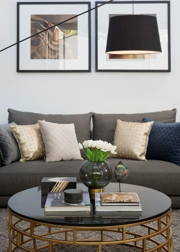
Gold. Gold is an instrumental colour used in property styling as it instils a sense of luxuriousness. Often the colour gold is associated with royalty, prosperity, and success. So, naturally, it works tremendously well in Brisbane property styling. In styling and staging your property, either painting or presenting furniture pieces with aspects of gold can add a regal charm and grandeur to a property that was not present beforehand. Gold is also a powerful purchase motivator for potential buyers; it appeals to the buyer’s perpetual desire of wanting to experience luxury. Gold signals success and success sells. For that reason, gold works very well as a colour of choice in home staging.
Colour psychology is a key part of making a room stand out and have its own personality. By focusing on changing the furnishing and design to match the psychology of the room, selling that property becomes much easier.